Westside German Shepherd Rescue
project
opportunity: redesign Westside German Shepherd Rescue’s (WGSR) website for mobile and desktop to:
improve the adoption experience
make donations easy for users
scope: 2 weeks, heuristic and c/c analysis, user interviews, usability tests, wireframes, responsive high-fidelity prototypes (desktop and mobile)
ux designers: Anthony Toledo, Ana Silva, June Jung
2-week design sprint
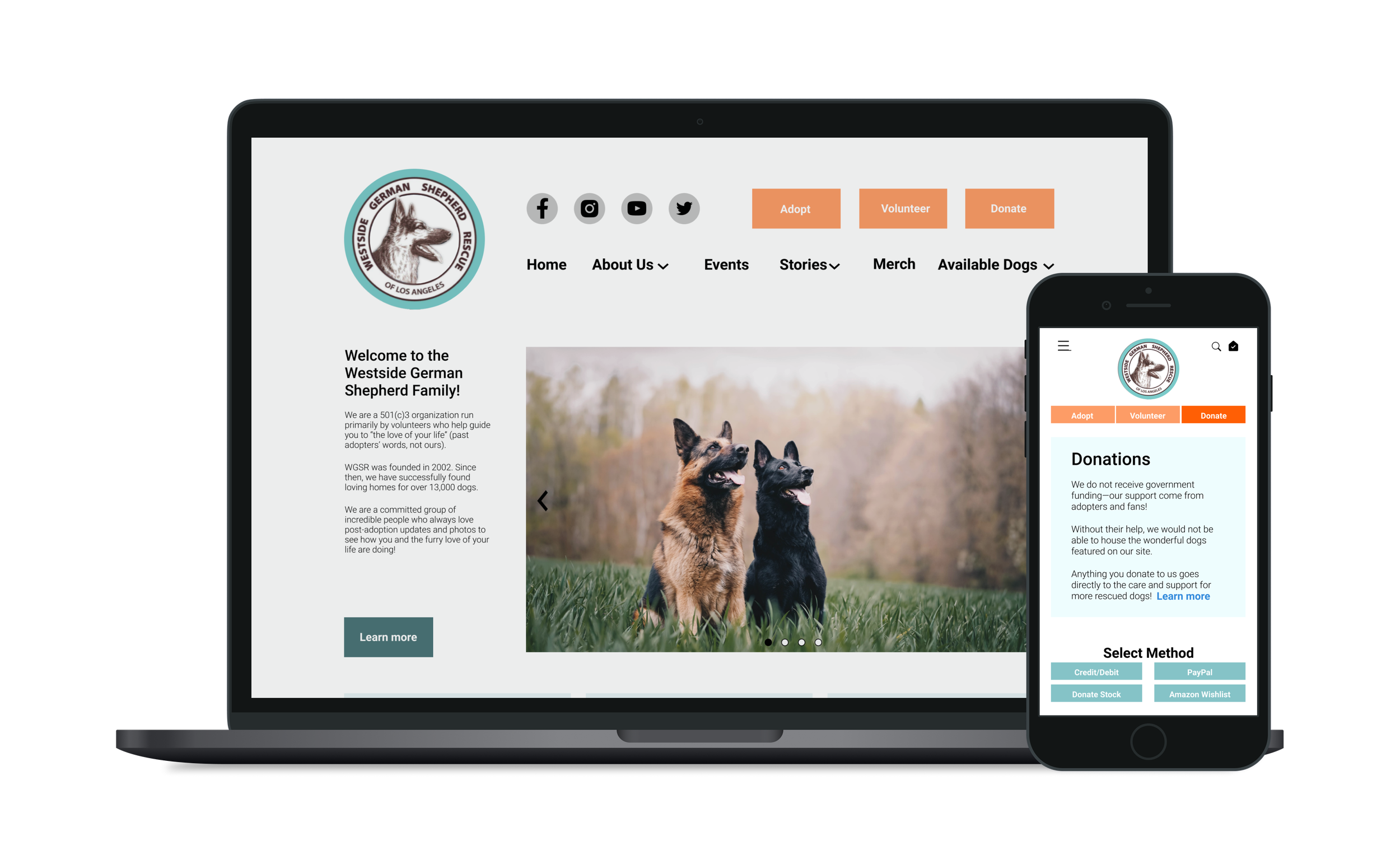
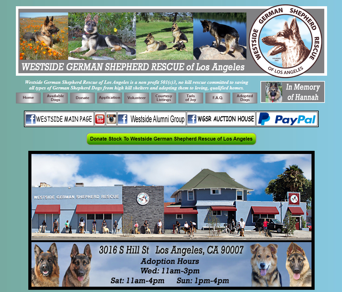
original website
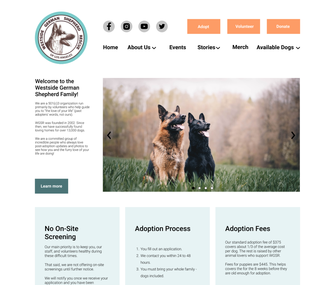
redesign
user interviews
We interviewed 3 recent people who had adopted a dog within the last year about their experiences. They shared the following pain points:
key painpoints
“Not hearing back on applications was frustrating (...) transparency on selection process would go a long way.”
“My application was rejected at PetSmart and they kept lying about the status (the manager’s out of town).”
user wants
users want to know their status regarding the dog adoption application process
user needs
users need a way to get the info they want regarding their application status
solution: status message with next steps
To let users know where they are in the adoption process and what to expect, we added a status message after the application has been submitted.
The status message:
lets users know that their application has been received
gives users a timeframe for when they’ll hear back about their application
provides users with instructions for what to do should they not hear back within said timeframe
contains information about next steps (application review, mandatory home check, family meeting)
user testing
Our asynchronous user test revealed that users were able to complete each task with relative ease—8 users completed each task, and 2 users bounced.
Users were asked to complete the following tasks:
log in
select interests
send a friend request
open a message thread
navigate to settings to edit profile
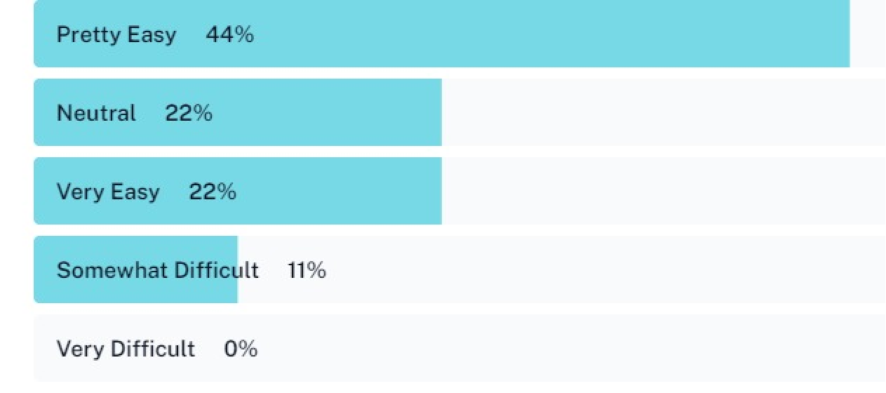
The graph shows that 6 out of 10 participants rated their experience navigating the app as either very easy or pretty easy.
A few participants shared that they were confused in some instances regarding where to click:
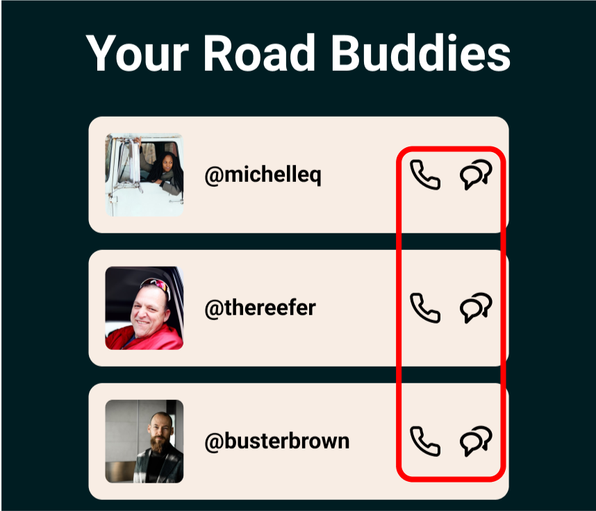
“When clicking on the message thread, I expected it to open without having to click on the message icon (too small click target area here)”
“It’s confusing to know when you’re supposed to be able to click something in the app”
Larger, more apparent buttons would benefit the user—something to address in future iterations. How close the message and call icons are could cause frustration on mobile devices.
reflection
collaboration
This project was a great opportunity to tailor my role according to what’s best for the team. In this case, a big part of my contribution was helping things move quickly. Given our 72-hour time crunch, I particularly enjoyed helping the team move quickly by:
sharing my Figma expertise with the team (auto layout, interactive components, etc.)
creating a design system of components that could be iterated rapidly
preparing and handing off design assets via Zeplin for developers
asynchronous user testing
Asynchronous tests certainly have their limitations, but I could see them being useful for testing smaller, more specific aspects of a design (rather than for general usability).
Participants complete them on their own time, making it easy to collect a large number of responses quickly. This could be useful for, say, testing one version of landing page copy versus another.